Inspired by the insight we gained about the economics of the contemporary art market after reading three books by Don Thompson, economist and professor of Branding and Marketing, we planned a tour of London’s contemporary art scene. From the first two books “The $12 Million Stuffed Shark” and “The Supermodel and the Brillo Box”, we discovered how the value of contemporary art is influenced by branding and back story. From the third book “The Orange Balloon Dog” we learned about non-taxed freeport warehouses, tricks auctioneers use to drive up bid values, and the motivations of buyers and sellers. The planned destinations for our Contemporary Art tour included visits to branded artist Damien Hirst’s Newport Gallery and branded collector Charles Saatchi’s self-named gallery.
The final stop would be to the Tate Modern, Britain’s national gallery of international modern and contemporary art, dealing with works dating from 1900 to the current day. Open since 2000, the gallery is situated in the former Bankside Power Station, which includes a 35 metre high and 152 metre long turbine hall that was turned into a dramatic entrance and display area, along with a boiler house and several oil tanks that were refitted with gallery spaces. The unique site makes an interesting setting for the presentation of contemporary art. There is no admission charge to visit the huge permanent collection and since there was so much to see for free, we did not feel the need to pay for the special exhibits, which included Picasso’s works from 1932 and a photography exhibit dealing with light.
The exhibition spaces in the Tate Modern are spread across two main buildings that are connected on a couple of the floors by long corridors. The permanent collection is grouped into eight themed areas including an intro to modern art, art’s response to social and political context, artistic processes, types of materials used, the impact of mass media and more. The largest themed areas with the majority of the works are found in the Natalie Bell Building (formerly the Boiler House) which houses the ticketed special exhibitions on the 3rd floor and large presentation spaces offering “Free Displays” on the second and fourth floors. The Blavatnik Building, named after Russian born billionaire, owner of Warner Records and major donor Len Blavatnik, consists of ten levels including smaller galleries, a members lounge, as well as a restaurant and observation deck on the top two floors. Interesting art can be found not just in the galleries, but also in the hallways and stairwells. American artist Jenny Holzer’s work titled “Inflammatory Essays” (1979-82) covers the walls of one stairwell with pages of provocative political and moral statements printed on multi-coloured paper. Each essay contains exactly 100 words across 20 lines of text that deliberately come across like the manifesto of a crackpot fanatic. Martin Creed’s white neon light sculpture (2001) is mounted above the fourth floor concourse of the Natalie Bell Building and ambiguously reads “The Whole World + The Work = The Whole World”. It has been said that this strange equation speaks to both the inclusiveness and the irrelevance of art? Found in the concourse of the Blavatnik Building, David Batchelor’s vibrant stacked fluorescent light boxes reflect the artificial colours that are found in a modern city. It is named “Spectrum of Brick Lane 2” (2007), after a restaurant-lined street in the east end of London.
After a quick cursory glance at the site map, we decided to begin on the second floor of the Natalie Bell Building, working our way up to the fourth floor and then across to the Blavatnik Building. The natural starting point for us to view the collection of the Tate Modern would have been the section titled “Start Display” which tries to give the viewer a basic introduction into the concepts behind modern and contemporary art including appreciation of format, colours, materials, size of the work and how the works make you feel. Unfortunately somehow we totally missed these rooms! It would have been helpful to see some of the works that illustrated the use and interaction of colours and shades including Yves Klein’s signature Blue, Maria Lalic’s Yellow tones, Josef Alber’s squares in various shades of blues and green, and Henri Matisse’s colourful collage of cut-out pieces of painted paper which he called “Snail”. I settled for looking at the images on Tate Modern’s website and made note that we need to return to this museum on our next visit to see what else we missed.
Instead we started in the area called “Artist & Society”. The theme of this section provides examples of how artists deal with social, political and historical circumstances, whether conveying an observation, reaction, commentary, protest or other message through their art. Lebanese artist Marwan Rechmaoui’s “Monument for the Living” (2001-2008) is a scale model of an unfinished office tower in Beirut, Lebanon that was used as a sniper outpost when civil war broke out in 1975. Now due to its size, it is too difficult and expensive to destroy, leaving a lofty abandoned shell that acts as a memorial to the conflict that was never truly resolved and led to 120,000 fatalities. In addition to this piece, an entire room was devoted to artists’ reactions to other 20th century civil wars, both as means of protest and to honour and remember the dead. Most represented were works created in reaction to the Spanish civil war (1936-39). Particularly poignant was AndrĂ© Fougeron’s oil painting “Martyred Spain” (1937) which uses the body of a dead horse and a raped woman to represent the innocent victims of the war. Peter de Francia’s painting (1953) depicts the execution of Greek Communist leader Nikos Beloyannis and three others after the Greek Civil War (1946-49) after they were unjustly accused of spying for the Soviet Union. Malangatana Ngwenya’s colourful untitled painting (1967) conveys the violence and suffering endured in Mozambique during the War of Independence from Portugal (1964-74) with depictions of almost cartoon-like teeth-wielding monstrous characters entangled and falling over each other.
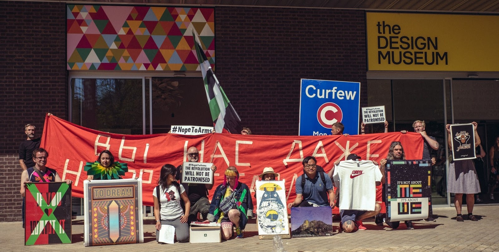
Jane Alexander’s installation called “African Adventure” (1999-2002) fills an entire room and addresses European interactions with Africa, commenting on colonialism, identity, democracy, apartheid, migration, trade, labour and faith. There are thirteen part humanoid, part animal creatures, some dressed in suits, overalls or a silk Christening dress, with monkey, bird and dog-like faces. They are positioned on red earth in reference to infertile soil found in Bushmanland, South Africa, and surrounded by sickles, machetes, boxes of explosives, tractors and agricultural cutting equipment. Carrie Mae Weems took a series of archival photos of black slaves, mounted them behind red glass and etched commentaries about slavery on top of them. These photos are bookmarked on either side by mirror images of the wife of a Mangbetu chief (1995). The first image is labelled “From Here I Saw What Happened…” while the second photo one completes the sentence with “.. And I Cried”. Kaveh Golestan photographed sex workers plying their trade within the red light district of Shahr-e No in Tehran, Iran between 1975-1977. In 1979 during the Iranian revolution, the area was deliberately set ablaze, killing many of the women, making what may be the final photos of these women so much more poignant and sad. In 1968, anti-capitalist, anti-consumerism protests in Paris led to a series of protest posters sponsored by the activist group Atelier Populaire, including a raised fist with the slogan that translates to “The Struggle Continues”, and an indictment against too much media called “You are being poisoned – television, radio, sheep”. These posters remind me of the Hope to Nope exhibit that we toured in the Design Museum.
Theaster Gates’ Civil Tapestry 4 (2011) is comprised of vertical strips of fire hoses arranged to look like an abstract painting. The hoses refer to a peaceful equal rights march by black school children in Alabama in 1963 where police used powerful fire hoses to disperse the crowd, injuring many of the youngsters. Barthelemy Toguo created a long banner called “Purification” (2012) with human figures painted in watercolour and handwritten sentences from the United Nations Declaration of Human Rights, such as “No one shall be subjected to torture…”. Teresa Margolles created a flag (2009) made of fabric that she covered with blood and soil taken from drug cartel-related murder scenes. Richard Hamilton’s oil painting “The Citizen” (1991) is based on a 1980 IRA protest in Northern Ireland where paramilitary inmates wore only prison blankets, which bore resemblance to “Christian martyrdom”.
The themed area called “Materials & Objects” explores the different materials that artists use in their works, as well as the techniques they apply to manipulate those materials. This includes the use or repurposing of “found objects” that challenge the concept of what constitutes as “art”. The most well-known example in this section was Marcel Duchamp’s “Fountain” (1917), where he took a common-place urinal and signed it with the pseudonym “R.Mutt”. The original was lost, so Duchamp had replicas made out of porcelain in 1964. Titled “Embryology” (1978), Polish artist Magdalna Abakanowicz stuffs sacks with old mattresses, clothing, and rags to created giant cocoon-like shapes that are her representations of biological systems and organic matter. Prior to reading the description about the work, from far away I thought they looked like potatoes. South Indian artist Sheela Gowda’s installation “Behold” (2009) filled a room with four kilometres of hand-knotted rope made of braided human hair which hang from the ceiling, as well as from car bumpers attached to the walls. In Gowda’s culture, tying short strands of human hair around the bumpers of vehicles is supposed to ward off accidents and bad luck. In addition to the superstitions, the car parts allude to India’s emerging economy and the increase in popularity of the automobile. Richard Deacon constructs sculptures from everyday materials and calls himself a “fabricator” instead of a sculptor. He made a series of numbered works called “Art For Other People” (1984-87). The one named “#24” is made from galvanized steel, bronze and PVC plastic while “#14” is comprised of curving bands of brass encompassing foam that is held together with chrome rivets and screws. I think the works were intended to be abstract, but to me, the first one looks like a peanut and the second one reminds me of a mouthguard. Ukraine artist Louise Nevelson creates large, intricate relief sculptures out of packing crates, old furniture and scrap timber including one called “Black Wall” (1959) which she painted all in black to make it look “more distinguished”.
Several works were made as collages, the technique of cutting and sticking small pieces of different source materials including photographs, newspaper or magazine clippings, posters, wallpaper, or fabric onto a backing such as a blank canvas or a painting, in order to form a new piece of art. Czech artist Jiri Kolar developed a technique called “prollage” where he interlaces vertical strips from two different images. In his series which he called “The Flowers of Evil” (1972), he cut out paintings from Italian art books that reflected passages from poems by French writer Charles Baudelaire and merged them with a photographic representation of the writer’s face, which was reprinted in shades of greens and blues. From afar, you clearly see Baudelaire’s face but as you get closer, will you be able to see the painting behind it. Italian artist Mimmo Rotella created collages from old movie posters and advertisements, making his works like “With a Smile” (1962) commentaries on post-war consumerism. American Romare Bearden’s “Pittsburgh Memory”(1964) reflected on the history of Black America and the Civil Rights Movement.
A group of eclectic works provide examples of unique and unusual processes of creation by artists from around the world. Ghana-born El Anatsui stitches together flattened bottle tops with copper wire to create a shimmering metal cloth. He turned commonplace disposable objects into a piece of abstract art as in the case of “Ink Splash II” (2012) where his careful distribution of colours from his bottle tops create the illusion of spilt ink which leaks onto the floor. Italian Pinto Gallizio explores the concepts of mass production and capitalist commodification by creating works using mechanized manufacturing techniques. For his work “Industrial Painting” (1958), paint is applied onto long rolls of canvas using a low-tech mechanical painting machine and then pieces are cut off and sold separately. American Sam Gilliam spread and dripped acrylic paint onto a canvas and then hung it from a leather string so that each time the “drape painting” called “Simmering” (1970) is hung, it takes a different form. French artist Niki de Saint Phalle’s series of works called “Shooting Picture” (1961) are created in part through performance art. A plaster-covered backing encapsulates polythene bags of paint which burst open and create splatters and drips when spectators (such as American artists Robert Rauschenberg and Jasper Johns) shot at them with guns. For “Tenkosei Kaosho” (1962), Japanese artist Kazuo Shiraga laid his canvas on the ground and applied layers of paint onto it with his feet while he was clinging to a rope for balance.
Another major area that we came across was called “In the Studio” which turned out to be the most nebulous in terms of intended theme and subject matter, but also contained some of the most well known artists (first names not required) and pieces of Modern Art. The stated purpose of the collection is to look at the close engagement between an artist’s process of making a work and the viewer’s experience of looking at it. Included in this area is a version of Degas’ iconic bronze “Little Dancer Aged Fourteen” (1922), a cubic bronze sculpture and oil painting of the bust of a woman by Picasso (1909), as well as quintessential works by Modigliani (1918) and Leger (1954). Works by some lesser known artists appealed to me including Christian Schad’s strange Self-Portrait (1927) where he wears a transparent shirt that reveals his bare chest, suggesting a desire to limit how much of himself he exposes to the viewer. Behind him lies a reclining female nude with a freggio scar on her face, typical of ones inflicted by Naples men on their lovers as a sign of possession. A narcissus flower leans towards the artist, referring to the Greek legend of Narcissus who fell in love with his own reflection and was turned into a flower by the Gods as punishment for his self-absorption. Salvador Dali’s surrealist painting “Metamorphosis of Narcissus” (1937) also deals with this myth as it depicts the transformation of Narcissus as a giant hand holding an egg from which the flower is emerging. This image is doubled and reflected in the water.
One of the most interesting items in this area was the “Lobster Telephone” (1936), also by Salvador Dali, which playfully covers the receiver of a rotary telephone with a rubber lobster, creating a classic surrealist object. For some reason, Dali associated telephones and lobsters (or food in general) with sex. Germaine Richier’s “Chess Board, Large Version” (1959) consists of five grotesque hybrid part-human part-animal figures used to represent the typical chess pieces of King, Queen, Knight, Castle and Bishop. The distorted figures reflected the anxieties and despair of post-war Europe. Gerhard Richter created paintings by applying paint layers on canvas and then dragging a squeegee across to create the effect of streaks and scrapings. I was a bit bewildered by the room that paired and compared the waterlily works (1916) of Claude Monet to the abstract rectangular colours found in Mark Rothko’s paintings (1950s). Rothko himself found a similarity but I couldn’t see it.
One of the rooms in this section was devoted to Kinetic and Optical Effects art made by a range of international artists linked to a group that was founded in Zagreb Croatia. These artists took ideas from mathematics, colour theory, computer generation and other scientific factors to create what they called “programmed art” that was meant to trigger visual sensations activated by the viewer’s perception of shape and colour. Made from strips painted aluminum and stainless steel, Venezuelan Carlos Cruz-Diez’s Physicromie No. 113 (1976) changes colour from black to grey and back to black again as you view it from one angle to another. France’s Jean-Pierre Yvaral’s Ambiguous Structure No.92 (1969) is an abstract painting in acrylic of squares aligned to form a grid. He used colour tones of blue, light grey-blue, grey, red and orange in a way that created a 3-D effect which makes the image seem to advance and then recede. Hungarian Victor Vasarely’s Supernovae (1959) illustrated his belief that the illusion of movement in 2-D was a type of physical movement in its own right. He created layered transparent screens each painted with geometric shapes that appear to move with the viewer. German artist, poet, and typographer Hansjorg Mayer’s Alphabet Square (1967) uses repetition and superimposition of letters of the alphabet to create his image. Fellow German Gunther Uecker’s White Field (1964) is made using nails that produce patterns of shadow which respond to light but change in relation to the viewer’s position. It was fun walking back and forth, trying to see the optical illusions of these works.
The Artist Rooms Collection consists of more than 1,600 works of modern and contemporary art, displayed across the UK in solo exhibitions that showcase the work of one of 40 major artists. The Tate Modern has a dedicated “Artist Rooms” section on the 4th floor of the Blavatnik Building where it presents rotating exhibitions highlighting the works of an artist from this collection. The artist featured during our visit was Bruce Nauman, an innovative American artist who works with different mediums and conveys his messages in humorous or absurd ways. We first encountered Nauman’s colourful neon-light sculptures back home at the Art Gallery of Ontario, where his hilarious “Double Poke In the Eye” (1985) work was on display. We saw it again at the Tate and still found it amusing as the rotating lights alternately show one of the two figures poking the other in the eye, and occasionally, they both poke at the same time (resulting in the double poke). Several other neon-light sculptures use clever word-play, puns and anagrams to give different meanings to common words or phrases, forcing the viewer to pay attention and think twice about what they are seeing. His “Run From Fear – Fun From Rear” (1972) takes two very similar phrases and interchanges two letters in each to create contrasting meanings and emotions. The work “Violins-Violence-Silence” (1981-2) groups words together that sound the same but have very different meanings. Organized in a triangular structure, as each word lights up on its own, you are led to think about what might connect them. A small hanging sculpture called “Hand Circle” (1996), made of bronze, silver solder and copper, depicts four casts of Nauman’s own hands, positioned to form a circle representing communication and relationship. Each hand seems to be making a gesture, whether pointing, extending an open palm or making an OK sign. For me, even more interesting than the actual sculpture was the shadow that it cast. “Three Large Animals” (1989) is a larger hanging sculpture consisting of three hybrid animal forms made of aluminum, whose heads and limbs are attached in anatomically incorrect positions to create strange yet familiar creatures. Nauman’s works of lithograph printing on paper continue the wordplay that he uses in his neon light sculptures. One piece presents the contradicting yet provocative sentiments of “Help Me” and “Hurt Me” (1975) with the word “DEAD” laid on top.
The Tate Modern’s collection of Contemporary and Modern Art was overwhelming and we did not allocate enough time to see everything. Although we saw many many works, we also missed a bunch of rooms. We did not even realize there was a 360 degree panoramic view of London that could be seen from the 10th floor of the Blavanik Building and did not have time to take any of the multiple free guided tours that were offered. We will definitely need to make another visit the next time we are in London.
Thursday, May 24, 2018
London 2018: Contemporary Art - Damien Hirst, Charles Saatchi
Ever since my husband Rich and I went to a library talk given by Don Thompson, an economist and professor of Marketing and Branding, who was promoting his book “The $12 Million Stuffed Shark: The Curious Economics of Contemporary Art”, we have become much more familiar with and fascinated by contemporary art and artists. We learned that successful branding involves creating a well-known and respected personality, distinctiveness and value to your product or service, usually achieved through marketing. In the Contemporary art world, branding has significant influence on the value of art. This can be seen by past sale prices of works created by branded artists such as Damien Hirst, Jeff Koons, or Andy Warhol, sold by branded art dealers such as Larry Gasgosian or branded auction houses such as Christie’s and Sotheby’s, purchased by branded collectors such as Charles Saatchi, and displayed at branded Contemporary Art Museums such as the Tate Modern.
I selected the $12 Million Stuffed Shark as my pick for our book club. To get into the spirit of the topic, I asked each participant to create their own piece of contemporary art, using some famous work as inspiration. I created 3 items, the first two as homages to Andy Warhol’s soup cans and his silk screen prints. The third was based on a story from the book about Damien Hirst taking a red marker and drawing a red nose on an obscure painting of Joseph Stalin by an unknown painter. Once Hirst signed the painting, its price jumped from 200 pounds to a final sale price of 140,000 pounds at auction. Our book club dinner was also theme related, with an entrĂ©e of chicken casserole made with Campbell’s Cream of Mushroom Soup (Warhol) and a carrot cake decorated with Damien Hirst-esque dots (aka smarties) and blue and white gummy sharks. We were thus quite excited about our plans for a Contemporary Art tour of London, including visits to Damien Hirst’s Newport Street Gallery and Pharmacy 2 Restaurant, as well as the Saatchi Gallery and the Tate Modern.
Located south of the Imperial War Museum on the South Bank of the Thames River and open since 2015, the Newport Street Gallery offers free admission to the public and hosts exhibitions that show works from Damien Hirst’s private collection. Taking over 3 buildings from 1913 that were originally used as workshops for producing theatre scenery, the Newport Street Gallery spans 37,000 square feet and includes six exhibition spaces spread over 2 floors. Hirst’s Pharmacy 2 Restaurant is also found on the second floor and we planned to eat lunch there after touring the gallery. The façade of the gallery is noted for the triangular protrusions at the top of one building, that look to me like mountain peaks or the points of a crown. Each peak or point contains a large skylight or window that allows light into the gallery.
Despite the spacious exhibition rooms, only two artists were featured on the day that we visited and their works were very sparsely hung in the large spaces. I guess this is the preferred method for displaying contemporary art, unlike the old days of the French Salon where paintings were stacked closely side by side and one on top of the other. The first exhibit was British artist Rachel Howard’s “Repetition Is Truth – Via Dolorosa” series, which according to the write-up is supposed to be inspired by Christ’s Stations of the Cross. This bewildered me since what I saw was a bunch of large yellow hued canvases with some faint grey and purple vertical lines. A couple of the pieces also seemed to include the tip of a paint brush, perhaps in the process of creating the vertical lines? One of these paintings was hung all by itself in a large room with the three other white walls completely bare. One work stood out from the rest, both in subject matter and its green and black colour scheme. For this particular piece, after reading the description I was able to see what the artist was depicting, which was a hooded Iraqi detainee in the Abu Ghraib prison with his arms outstretched as he is being tortured by electric wires attached to his fingers and genitals. I wish I was able to understand how to interpret the rest of these works, but I couldn't and so they did not appeal to me.
I liked the second exhibit much more although my Contemporary Art appreciation knowledge was probably not vast enough to grasp its deeper meanings either. It was American artist John Copeland’s series of acrylic and oil paintings called “Your Heaven Looks Just Like My Hell”. Not quite in the same league as Damien Hirst (who named his iconic stuffed shark sculpture “The Physical Impossibility of Death in the Mind of Someone Living”), Copeland also uses curious, enigmatic names for not only his exhibition but his works as well. His paintings have titles like “My Favorite Terrible Ideas” or “And I Cursed the Sun for Rising” which sound interesting but don’t have any obvious correlation to what you see in the works. The first room of this exhibit contains what I assume is Copeland’s interpretation of the female nude trope historically prevalent in art works. His females often have bright green or red hair and often come in pairs or doubles. My three favourites were titled “A Difficult Set of Instructions” (girl with green hair), “Transmission - Imaginary Rules” (girl blowing bubblegum) and “The Bullet Screams Past” (pair of women rotated 45 degrees counter-clockwise each with her hand covering her mouth).
Copeland often uses found photographic images from magazine pullouts as the starting point of his works. The next rooms contain ambiguous or incongruent social scenes of people interacting. They are often in the act of looking or viewing, as depicted in “Before the Beginning” where you see the backs of three people who seem to be viewing a large mural of biker gangs rumbling (possibly the Hell’s Angels?) , or “A Loud Silence” where a crowd seem to be inexplicably milling around in front of a reclining nude. At first glance, his painting of two couples frolicking in the water seems playful and joyous. But the ominous title “You Should Have Known How Things Would End” makes you take a second look, where you then notice the disfigured faces of the participants and grasp of the woman wearing the orange swimsuit, which now suddenly can seem menacing. The strange point of view of the trope of a “table scene” in the painting “Wrong is Always Right” also gives one pause. The viewer is looking down upon the table where the heads of half the participants have been cut off. Focus is drawn to the woman turned away from the table and you wonder why? Copeland says that his works are “a starting point for conversation or digression, like a riddle .. that raises questions that aren’t really answerable”.
The problem with having only one or two exhibits within your art gallery is that if the works of those few artists don’t resonate with your visitors, then there is not much recourse. Luckily for us, while we did not connect either emotionally or intellectually with the works of Rachel Howard, we were intrigued by the paintings of John Copeland. But the gallery visit was actually just a bonus since our real goal was to have lunch at Damien Hirst’s Pharmacy 2 restaurant, inspired by his works featuring medicine cabinets and the 1992 installation called “Pharmacy” which was first displayed in the Cohen Gallery in New York City before being installed at the Tate Modern. His first medicine cabinet was called “Sinner” (1988) and represented the medicines that his grandmother used before dying of lung cancer. The installation was a room-sized, site-specific representation of a pharmacy that included glass-fronted cabinets with pharmaceutical drugs on the shelves, desks and chairs behind a counter that holds four coloured apothecary bottles filled with coloured liquids representing earth, air, fire and water. When this work was at the Cohen Gallery, visitors mistook it for a real pharmacy and frequently asked where the Damien Hirst exhibition could be found.
The Pharmacy 2 Restaurant expands on the concepts of Hirst’s Pharmacy art pieces with images and references to pills and drugs everywhere. There is a glass case full of candy-coloured pills and capsules at the entrance to the restaurant, images of pills on the metal cupboards, the back of chairs and seating booths and inlaid in the marble floors. Embroidered logos of pharmaceutical companies cover the walls. An explosion of colour emanates from the stained glass windows depicting DNA strands in vibrant reds, whites and blues that can be seen from the street level at night. The side panels of a stainless steel and glass-topped bar are covered with multi-coloured pills that look like jelly beans from afar. The backsplashes of the bar feature the similar DNA motif as the front windows and the seats of the bar stools resemble tablets of various types of medicines.
It was so much fun to sit in this restaurant that we would not have minded if the food was just mediocre, but it turned out that the food was actually really good. Celebrity British chef Mark Hix collaborates with Hirst at Pharmacy 2 (the second Hirst restaurant after his original one in Notting Hill closed in 1998) and serves classic British and European cuisine made from fresh ingredients. We were lucky to be in London during soft shell crab season and made the most of it by ordering it every chance we got. We shared battered broccoli and buttered asparagus served with a hollandaise sauce, then each had the soft shell crab burger served with lettuce, kimchi and an aioli mayonnaise, with shoe-string potato fries on the side. I'm not sure the Newport Gallery alone would be worth the trek since there is so little art on display, but if you want to experience this restaurant for the first time, then it is definitely a fun experience.
Charles Saatchi is the branded art collector and philanthropist whose endorsement and patronage of young, unknown British artists in the 1990s helped launch their careers. He coined the terms “BritArt” and “YBAs” (Young British Artists), with the most famous member of that group being Damien Hirst, whose tiger shark preserved in formaldehyde in a large display case was funded and purchased by Saatchi. Open since 1985, the Saatchi Gallery provides a space for Saatchi to share his large collection with the public, which he does free of charge, supported by a partnership with the auction house Phillips de Pury & Co. The location of the gallery has changed several times since its original opening and now resides in the Chelsea district, housed in the Duke of York’s Headquarters, once the home of the Royal Military School. The new Saatchi Gallery spans 70,000-square-foot (almost double the size of Newport Gallery) with 15 exhibition spaces. Accordingly, Saatchi is able to display works from many more different artists than what is shown at Damien Hirst’s gallery. Charles Saatchi’s goal is to make contemporary art accessible to the mainstream population and highlight relatively unknown artists in hopes of propelling them to become the next rising stars.
The Saatchi Gallery featured a slew of artists from around the world who we were introduced to for the first time. The main exhibit running during our visit was titled “Known Unknown”, aptly reflecting Saatchi’s main goal for his gallery. It showcased 17 diverse and eclectic international artists who are mostly unknown in the mainstream art world, but are admired and considered up and coming by their contemporaries. We enjoyed and admired many of these works, but wish that they had been curated with explanation of what we were looking at. Instead there was only the name of the artist and work as well as the materials used. Even the descriptions found on the gallery's website were delivered in "artspeak", the practice of describing art pieces with high-brow, important sounding art jargon that is usually unintelligible to the casual viewer. If Saatchi's goal is really to bring art to the masses, then the descriptions of the pieces should have been presented next to the works and in a manner that would be understandable by the layman.
My favourite artist from the Known Unknown exhibit was Hungarian painter Mona Osman, whose vibrant and fantastical works, made from oil, paper collage and resin on canvas, contained colour patterns and designs that reminded me of Gustav Klimt and featured warped humanoid forms that could have come from a Sci Fi movie, like the ones in Star Wars: A New Hope’s Cantina Bar scene. Born in the Philippines, raised in Japan, studied art and now based in the U.K., the influences of Maria Farrar’s West vs East cultural background can be found in her oil on linen paintings. While subject matters like the one depicted in “Baguette” exude a European flare, the flat perspective and calligraphy-like brush strokes of works like “Birthday” can directly be attributed to her time spent in Japan. Farrar’s work is said to be personal and autobiographical, which makes you wonder at the title and the images found in “Saving My Parents From Drowning in the Shimonoseki Straits.” Is the depiction of the turbulent waves, the orange life preserver and the upturned foot wearing a white high-heeled shoe supposed to be whimsical or is this a real and possibly traumatic event?
I was also intrigued by the abstract acrylic and oil on canvas paintings by German artist Stefanie Heinze which each seemed to feature parts of an elephant. I have not found any reference to the significance of the elephant motifs in her work, but I started to think that I was seeing elephants everywhere when I inspected the ceramic sculpture “Sevres vase Ă Bobèches” by American artist Francesca Dimattio that was displayed in the same room as Stefanie Heinze’s paintings. Made of overglaze and underglaze with gold lustre on porcelain, from a certain angle, I distinctly saw the head and trunk of an elephant! I even thought initially that the ceramics were by the same artist as the paintings. However after examining Dimattio’s other works including the one called “Confection”, I’ve decided that there was not a connection here and that I just had elephants on the brain.
Danish artist Kirstine Roepstorff creates large-scaled mixed media collages mounted on aluminum that are made from materials including paper, paint, wallpaper, glitter, pearls, sequins, cloth, vinyl, tinsel, silver leaf, wood, vellum, iron-on decals, magazine cut-outs and more. The images in her work comment on politics and power. The piece ominously titled “You Are Being Lied To” presents a pretty green-space that could be part of a golf course with a water feature and sand traps, but the treetops are augmented with sparkly streamers, stars and flowers that give the setting a fantastical feel. On top of this background, she layers a disparate mixture of images including a Mafioso dressed in a white suit and dark sun glasses, soccer player, boxer, folk singer with guitar, British “Bobby”, motorcycle rider, a policeman making an arrest, turbaned Indians, portaging canoeists, marching Asian militants, loggers, nudists, walking skeletons and a winged angel-like figure. Interspersed with this are images of military force including fighter jets, armed soldiers, uniformed generals, as well as various religious symbols or rituals from various cultures. This collage feels like a modern day version of works by Hieronymus Bosch, who also incorporated many different characters and small vignettes into his paintings. Roepstorff’s piece is said to deal with the difference between the “reality portrayed in the media vs the reality or truth of a situation”, which seems to tie in with the title of the work. By cutting out and repurposing or repositioning the realities portrayed by newspaper or magazine stories, Roepstorff is able to present her own message. I also liked the collage called “Exercise Within the Frame” where the pasted fragments of leaves made from cloth or vinyl span beyond the frame of the work, giving it a 3-dimensional life beyond the usual boundaries of a non-sculptural art piece.
There were a few artists still on display from a previous exhibit called “Iconoclasts: Art Out of the Mainstream” that had ended before our visit. The show featured 13 artists who strayed from artistic norms by creating their works using “ground-breaking experimental techniques”. The artist whose technique I thought was most interesting was Italian-born Maurizio Anzeri, who takes vintage photographs and augments them by embroidering contemporary designs to create 3-D “photo sculptures”. The multi-coloured embroidery and playful patterns pop against the sepia or black and white photos, turning old photos into new creative artworks.
French multi-media artist Thomas Mailaender’s creation of “sunburn photos” using the human skin as his canvas is in part performance art. He places original negatives from old photographs onto the skin of his models and applies a UV lamp over them, resulting in the image appearing on the skin’s surface for a fleeting amount of time. He quickly photographs his models with their “sunburns” before exposure to daylight cause them to disappear. This unique and slightly creepy process definitely qualified Mailaender to be chosen for the Iconoclast exhibit.
Another interesting exhibit was award-winning Lizzie Sadin’s photography exposĂ© called “The Trap – Trafficking of Women in Nepal” which documents the prevalent issues of human trafficking and forced prostitution in Nepal and explores the causes which include economic poverty, lack of education and opportunities, as well as social and cultural beliefs and values which deem women as inferior to men. Lured by promises of work, money, beautiful clothes and jewelry, young girls are lured by traffickers to cross the border from Nepal to India (sometimes via Sri Lanka) where they are enslaved, beaten, starved into submission and then forced into servitude in brothels or assigned as “maids” working over 20 hours a day where they are often sexually molested or raped. It is estimated that in a year, over 15000 girls are taken into sexual or domestic servitude but less than 200 are reported missing. Sadin’s photos show Nepal police and the anti-trafficking advocacy group KI Nepal boarding buses about to cross the border, looking for suspicious pairings of potential traffickers and victims. She profiles several victims, telling their horrific but sadly similar stories. Some of the most impactful photos of the series are the ones that Sadin took secretly, as noted by the caption “This photo was taken covertly”. These seedy images include the owner of a dance bar simulating intercourse or rape of a dancer in order to excite his customers, a bouncer positioned in front of a dance bar to prevent the girls from escaping, and young girls summoned to private “cabins” within a brothel/bar where men are waiting to touch or initiate intercourse with them.
We saw many interesting exhibits at the Saatchi Gallery and found it much more enjoyable than the Damien Hirst Newport Gallery. But surprisingly, our favourite part of this visit was the gift shop. As usual, you are forced through the gift shop as part of the path through the building, but this time, we actually spent quite a while in there looking at all the cool items. Rich was particularly amused by the oxymoron of the Karl Marx “Das Kapital” Money Bank. There were some fun childrens’ books including LLAMAPhones (Homophones as depicted by Llama images) and Baby Duck/Baby Koala finger puppet books. I liked the extremely “punny” Chairman Meow poster and the cards with visual puns including “mood swings”, “support bras” and “recreational drugs”. I was really excited to see the giant gorilla sculpture, which I believe was referenced in the movie “The Square”, a hilarious satire mocking contemporary art and the practise of artists, curators and art critics to participate in pretentiously unintelligible “artspeak”. In a scene in that movie, with no explanation, a gorilla enters an apartment, plops down on the couch and starts reading a magazine. I was befuddled at the significance of the gorilla in the movie, but perhaps it was inspired by this one in the Saatchi shop?
My favourite item from the Saatchi Shop was the “Lenticular Bookmark” (also available as a ruler) which features a row of figures each in midst of performing an activity such as jumping rope, bouncing a ball, riding a unicycle or spinning a hula hoop. As you rotate the bookmark forwards or backwards, the figures begin to move. I bought one of these bookmarks as a souvenir, but wished I had bought a couple more to give as gifts. Our Contemporary Art Tour continues with a visit to the Tate Modern Gallery, which is even larger and more comprehensive than the Saatchi Gallery. Since this blog has run on long enough and there is so much to describe about the Tate Modern, I will leave that for the next blog.
I selected the $12 Million Stuffed Shark as my pick for our book club. To get into the spirit of the topic, I asked each participant to create their own piece of contemporary art, using some famous work as inspiration. I created 3 items, the first two as homages to Andy Warhol’s soup cans and his silk screen prints. The third was based on a story from the book about Damien Hirst taking a red marker and drawing a red nose on an obscure painting of Joseph Stalin by an unknown painter. Once Hirst signed the painting, its price jumped from 200 pounds to a final sale price of 140,000 pounds at auction. Our book club dinner was also theme related, with an entrĂ©e of chicken casserole made with Campbell’s Cream of Mushroom Soup (Warhol) and a carrot cake decorated with Damien Hirst-esque dots (aka smarties) and blue and white gummy sharks. We were thus quite excited about our plans for a Contemporary Art tour of London, including visits to Damien Hirst’s Newport Street Gallery and Pharmacy 2 Restaurant, as well as the Saatchi Gallery and the Tate Modern.
Located south of the Imperial War Museum on the South Bank of the Thames River and open since 2015, the Newport Street Gallery offers free admission to the public and hosts exhibitions that show works from Damien Hirst’s private collection. Taking over 3 buildings from 1913 that were originally used as workshops for producing theatre scenery, the Newport Street Gallery spans 37,000 square feet and includes six exhibition spaces spread over 2 floors. Hirst’s Pharmacy 2 Restaurant is also found on the second floor and we planned to eat lunch there after touring the gallery. The façade of the gallery is noted for the triangular protrusions at the top of one building, that look to me like mountain peaks or the points of a crown. Each peak or point contains a large skylight or window that allows light into the gallery.
Despite the spacious exhibition rooms, only two artists were featured on the day that we visited and their works were very sparsely hung in the large spaces. I guess this is the preferred method for displaying contemporary art, unlike the old days of the French Salon where paintings were stacked closely side by side and one on top of the other. The first exhibit was British artist Rachel Howard’s “Repetition Is Truth – Via Dolorosa” series, which according to the write-up is supposed to be inspired by Christ’s Stations of the Cross. This bewildered me since what I saw was a bunch of large yellow hued canvases with some faint grey and purple vertical lines. A couple of the pieces also seemed to include the tip of a paint brush, perhaps in the process of creating the vertical lines? One of these paintings was hung all by itself in a large room with the three other white walls completely bare. One work stood out from the rest, both in subject matter and its green and black colour scheme. For this particular piece, after reading the description I was able to see what the artist was depicting, which was a hooded Iraqi detainee in the Abu Ghraib prison with his arms outstretched as he is being tortured by electric wires attached to his fingers and genitals. I wish I was able to understand how to interpret the rest of these works, but I couldn't and so they did not appeal to me.
I liked the second exhibit much more although my Contemporary Art appreciation knowledge was probably not vast enough to grasp its deeper meanings either. It was American artist John Copeland’s series of acrylic and oil paintings called “Your Heaven Looks Just Like My Hell”. Not quite in the same league as Damien Hirst (who named his iconic stuffed shark sculpture “The Physical Impossibility of Death in the Mind of Someone Living”), Copeland also uses curious, enigmatic names for not only his exhibition but his works as well. His paintings have titles like “My Favorite Terrible Ideas” or “And I Cursed the Sun for Rising” which sound interesting but don’t have any obvious correlation to what you see in the works. The first room of this exhibit contains what I assume is Copeland’s interpretation of the female nude trope historically prevalent in art works. His females often have bright green or red hair and often come in pairs or doubles. My three favourites were titled “A Difficult Set of Instructions” (girl with green hair), “Transmission - Imaginary Rules” (girl blowing bubblegum) and “The Bullet Screams Past” (pair of women rotated 45 degrees counter-clockwise each with her hand covering her mouth).
Copeland often uses found photographic images from magazine pullouts as the starting point of his works. The next rooms contain ambiguous or incongruent social scenes of people interacting. They are often in the act of looking or viewing, as depicted in “Before the Beginning” where you see the backs of three people who seem to be viewing a large mural of biker gangs rumbling (possibly the Hell’s Angels?) , or “A Loud Silence” where a crowd seem to be inexplicably milling around in front of a reclining nude. At first glance, his painting of two couples frolicking in the water seems playful and joyous. But the ominous title “You Should Have Known How Things Would End” makes you take a second look, where you then notice the disfigured faces of the participants and grasp of the woman wearing the orange swimsuit, which now suddenly can seem menacing. The strange point of view of the trope of a “table scene” in the painting “Wrong is Always Right” also gives one pause. The viewer is looking down upon the table where the heads of half the participants have been cut off. Focus is drawn to the woman turned away from the table and you wonder why? Copeland says that his works are “a starting point for conversation or digression, like a riddle .. that raises questions that aren’t really answerable”.
The problem with having only one or two exhibits within your art gallery is that if the works of those few artists don’t resonate with your visitors, then there is not much recourse. Luckily for us, while we did not connect either emotionally or intellectually with the works of Rachel Howard, we were intrigued by the paintings of John Copeland. But the gallery visit was actually just a bonus since our real goal was to have lunch at Damien Hirst’s Pharmacy 2 restaurant, inspired by his works featuring medicine cabinets and the 1992 installation called “Pharmacy” which was first displayed in the Cohen Gallery in New York City before being installed at the Tate Modern. His first medicine cabinet was called “Sinner” (1988) and represented the medicines that his grandmother used before dying of lung cancer. The installation was a room-sized, site-specific representation of a pharmacy that included glass-fronted cabinets with pharmaceutical drugs on the shelves, desks and chairs behind a counter that holds four coloured apothecary bottles filled with coloured liquids representing earth, air, fire and water. When this work was at the Cohen Gallery, visitors mistook it for a real pharmacy and frequently asked where the Damien Hirst exhibition could be found.
The Pharmacy 2 Restaurant expands on the concepts of Hirst’s Pharmacy art pieces with images and references to pills and drugs everywhere. There is a glass case full of candy-coloured pills and capsules at the entrance to the restaurant, images of pills on the metal cupboards, the back of chairs and seating booths and inlaid in the marble floors. Embroidered logos of pharmaceutical companies cover the walls. An explosion of colour emanates from the stained glass windows depicting DNA strands in vibrant reds, whites and blues that can be seen from the street level at night. The side panels of a stainless steel and glass-topped bar are covered with multi-coloured pills that look like jelly beans from afar. The backsplashes of the bar feature the similar DNA motif as the front windows and the seats of the bar stools resemble tablets of various types of medicines.
It was so much fun to sit in this restaurant that we would not have minded if the food was just mediocre, but it turned out that the food was actually really good. Celebrity British chef Mark Hix collaborates with Hirst at Pharmacy 2 (the second Hirst restaurant after his original one in Notting Hill closed in 1998) and serves classic British and European cuisine made from fresh ingredients. We were lucky to be in London during soft shell crab season and made the most of it by ordering it every chance we got. We shared battered broccoli and buttered asparagus served with a hollandaise sauce, then each had the soft shell crab burger served with lettuce, kimchi and an aioli mayonnaise, with shoe-string potato fries on the side. I'm not sure the Newport Gallery alone would be worth the trek since there is so little art on display, but if you want to experience this restaurant for the first time, then it is definitely a fun experience.
Charles Saatchi is the branded art collector and philanthropist whose endorsement and patronage of young, unknown British artists in the 1990s helped launch their careers. He coined the terms “BritArt” and “YBAs” (Young British Artists), with the most famous member of that group being Damien Hirst, whose tiger shark preserved in formaldehyde in a large display case was funded and purchased by Saatchi. Open since 1985, the Saatchi Gallery provides a space for Saatchi to share his large collection with the public, which he does free of charge, supported by a partnership with the auction house Phillips de Pury & Co. The location of the gallery has changed several times since its original opening and now resides in the Chelsea district, housed in the Duke of York’s Headquarters, once the home of the Royal Military School. The new Saatchi Gallery spans 70,000-square-foot (almost double the size of Newport Gallery) with 15 exhibition spaces. Accordingly, Saatchi is able to display works from many more different artists than what is shown at Damien Hirst’s gallery. Charles Saatchi’s goal is to make contemporary art accessible to the mainstream population and highlight relatively unknown artists in hopes of propelling them to become the next rising stars.
The Saatchi Gallery featured a slew of artists from around the world who we were introduced to for the first time. The main exhibit running during our visit was titled “Known Unknown”, aptly reflecting Saatchi’s main goal for his gallery. It showcased 17 diverse and eclectic international artists who are mostly unknown in the mainstream art world, but are admired and considered up and coming by their contemporaries. We enjoyed and admired many of these works, but wish that they had been curated with explanation of what we were looking at. Instead there was only the name of the artist and work as well as the materials used. Even the descriptions found on the gallery's website were delivered in "artspeak", the practice of describing art pieces with high-brow, important sounding art jargon that is usually unintelligible to the casual viewer. If Saatchi's goal is really to bring art to the masses, then the descriptions of the pieces should have been presented next to the works and in a manner that would be understandable by the layman.
My favourite artist from the Known Unknown exhibit was Hungarian painter Mona Osman, whose vibrant and fantastical works, made from oil, paper collage and resin on canvas, contained colour patterns and designs that reminded me of Gustav Klimt and featured warped humanoid forms that could have come from a Sci Fi movie, like the ones in Star Wars: A New Hope’s Cantina Bar scene. Born in the Philippines, raised in Japan, studied art and now based in the U.K., the influences of Maria Farrar’s West vs East cultural background can be found in her oil on linen paintings. While subject matters like the one depicted in “Baguette” exude a European flare, the flat perspective and calligraphy-like brush strokes of works like “Birthday” can directly be attributed to her time spent in Japan. Farrar’s work is said to be personal and autobiographical, which makes you wonder at the title and the images found in “Saving My Parents From Drowning in the Shimonoseki Straits.” Is the depiction of the turbulent waves, the orange life preserver and the upturned foot wearing a white high-heeled shoe supposed to be whimsical or is this a real and possibly traumatic event?
I was also intrigued by the abstract acrylic and oil on canvas paintings by German artist Stefanie Heinze which each seemed to feature parts of an elephant. I have not found any reference to the significance of the elephant motifs in her work, but I started to think that I was seeing elephants everywhere when I inspected the ceramic sculpture “Sevres vase Ă Bobèches” by American artist Francesca Dimattio that was displayed in the same room as Stefanie Heinze’s paintings. Made of overglaze and underglaze with gold lustre on porcelain, from a certain angle, I distinctly saw the head and trunk of an elephant! I even thought initially that the ceramics were by the same artist as the paintings. However after examining Dimattio’s other works including the one called “Confection”, I’ve decided that there was not a connection here and that I just had elephants on the brain.
Danish artist Kirstine Roepstorff creates large-scaled mixed media collages mounted on aluminum that are made from materials including paper, paint, wallpaper, glitter, pearls, sequins, cloth, vinyl, tinsel, silver leaf, wood, vellum, iron-on decals, magazine cut-outs and more. The images in her work comment on politics and power. The piece ominously titled “You Are Being Lied To” presents a pretty green-space that could be part of a golf course with a water feature and sand traps, but the treetops are augmented with sparkly streamers, stars and flowers that give the setting a fantastical feel. On top of this background, she layers a disparate mixture of images including a Mafioso dressed in a white suit and dark sun glasses, soccer player, boxer, folk singer with guitar, British “Bobby”, motorcycle rider, a policeman making an arrest, turbaned Indians, portaging canoeists, marching Asian militants, loggers, nudists, walking skeletons and a winged angel-like figure. Interspersed with this are images of military force including fighter jets, armed soldiers, uniformed generals, as well as various religious symbols or rituals from various cultures. This collage feels like a modern day version of works by Hieronymus Bosch, who also incorporated many different characters and small vignettes into his paintings. Roepstorff’s piece is said to deal with the difference between the “reality portrayed in the media vs the reality or truth of a situation”, which seems to tie in with the title of the work. By cutting out and repurposing or repositioning the realities portrayed by newspaper or magazine stories, Roepstorff is able to present her own message. I also liked the collage called “Exercise Within the Frame” where the pasted fragments of leaves made from cloth or vinyl span beyond the frame of the work, giving it a 3-dimensional life beyond the usual boundaries of a non-sculptural art piece.
There were a few artists still on display from a previous exhibit called “Iconoclasts: Art Out of the Mainstream” that had ended before our visit. The show featured 13 artists who strayed from artistic norms by creating their works using “ground-breaking experimental techniques”. The artist whose technique I thought was most interesting was Italian-born Maurizio Anzeri, who takes vintage photographs and augments them by embroidering contemporary designs to create 3-D “photo sculptures”. The multi-coloured embroidery and playful patterns pop against the sepia or black and white photos, turning old photos into new creative artworks.
French multi-media artist Thomas Mailaender’s creation of “sunburn photos” using the human skin as his canvas is in part performance art. He places original negatives from old photographs onto the skin of his models and applies a UV lamp over them, resulting in the image appearing on the skin’s surface for a fleeting amount of time. He quickly photographs his models with their “sunburns” before exposure to daylight cause them to disappear. This unique and slightly creepy process definitely qualified Mailaender to be chosen for the Iconoclast exhibit.
Another interesting exhibit was award-winning Lizzie Sadin’s photography exposĂ© called “The Trap – Trafficking of Women in Nepal” which documents the prevalent issues of human trafficking and forced prostitution in Nepal and explores the causes which include economic poverty, lack of education and opportunities, as well as social and cultural beliefs and values which deem women as inferior to men. Lured by promises of work, money, beautiful clothes and jewelry, young girls are lured by traffickers to cross the border from Nepal to India (sometimes via Sri Lanka) where they are enslaved, beaten, starved into submission and then forced into servitude in brothels or assigned as “maids” working over 20 hours a day where they are often sexually molested or raped. It is estimated that in a year, over 15000 girls are taken into sexual or domestic servitude but less than 200 are reported missing. Sadin’s photos show Nepal police and the anti-trafficking advocacy group KI Nepal boarding buses about to cross the border, looking for suspicious pairings of potential traffickers and victims. She profiles several victims, telling their horrific but sadly similar stories. Some of the most impactful photos of the series are the ones that Sadin took secretly, as noted by the caption “This photo was taken covertly”. These seedy images include the owner of a dance bar simulating intercourse or rape of a dancer in order to excite his customers, a bouncer positioned in front of a dance bar to prevent the girls from escaping, and young girls summoned to private “cabins” within a brothel/bar where men are waiting to touch or initiate intercourse with them.
We saw many interesting exhibits at the Saatchi Gallery and found it much more enjoyable than the Damien Hirst Newport Gallery. But surprisingly, our favourite part of this visit was the gift shop. As usual, you are forced through the gift shop as part of the path through the building, but this time, we actually spent quite a while in there looking at all the cool items. Rich was particularly amused by the oxymoron of the Karl Marx “Das Kapital” Money Bank. There were some fun childrens’ books including LLAMAPhones (Homophones as depicted by Llama images) and Baby Duck/Baby Koala finger puppet books. I liked the extremely “punny” Chairman Meow poster and the cards with visual puns including “mood swings”, “support bras” and “recreational drugs”. I was really excited to see the giant gorilla sculpture, which I believe was referenced in the movie “The Square”, a hilarious satire mocking contemporary art and the practise of artists, curators and art critics to participate in pretentiously unintelligible “artspeak”. In a scene in that movie, with no explanation, a gorilla enters an apartment, plops down on the couch and starts reading a magazine. I was befuddled at the significance of the gorilla in the movie, but perhaps it was inspired by this one in the Saatchi shop?
My favourite item from the Saatchi Shop was the “Lenticular Bookmark” (also available as a ruler) which features a row of figures each in midst of performing an activity such as jumping rope, bouncing a ball, riding a unicycle or spinning a hula hoop. As you rotate the bookmark forwards or backwards, the figures begin to move. I bought one of these bookmarks as a souvenir, but wished I had bought a couple more to give as gifts. Our Contemporary Art Tour continues with a visit to the Tate Modern Gallery, which is even larger and more comprehensive than the Saatchi Gallery. Since this blog has run on long enough and there is so much to describe about the Tate Modern, I will leave that for the next blog.
Wednesday, May 23, 2018
London 2018: Notting Hill - Holland Park, Design Museum, Portobello Road Market
It seems like the districts surrounding Hyde Park and Kensington Palace are all affluent areas, including Bayswater to the north, Mayfair and Marylebone to the East and Belgravia, Chelsea and Kensington to the south. This trend continues with Notting Hill, found on the west side of Hyde Park and also known as the setting for the 1999 romantic comedy of the same name starring Hugh Grant and Julia Roberts. From our rental apartment in Earls Court, it is a 6km walk directly north to get to Notting Hill, where we planned to visit the famous Portobello Road Market, with stops at Holland Park and the Design Museum along the way. Holland Park is a 54 acre public park which was once part of the estate of Lord Holland, whose sculpture is prominently on display. It includes the east wing and some ruins of Holland House, a Japanese (Kyoto) garden as well as other formal gardens, an orangery, a wilderness area, sports fields including tennis courts, cricket fields and a children’s play area. The park is surrounded by a main street called Holland Park Avenue where many high-end restaurants, shops and spas can be found, as well as 3 smaller residential streets. Confusingly, two of these streets are also called Holland Park, where rows of large Victorian townhouses can be found surrounded by mature trees. The third is called Holland Park Mews, containing rows of smaller carriage houses, but these Mews seem much more upscale than some of the ones we have seen in other parts of London.
The London Design Museum focuses on graphics, product and industrial, fashion and architectural design. A free exhibit called “Designer Maker User” offers an introduction to the history of contemporary design. A rotating sign alternately displays the words “DESIGNER”, “MAKER” and “USER”, representing the three partners in the design process. The first display at the entrance of the exhibit is called the “crowd-sourced wall” which consists of around 200 items from 25 countries which were suggested by the public to be items important to their daily lives. Items found on this wall include the London underground sign, a bicycle, a jar of marmite, a hot water bottle, rotary phones, Levi jeans and more. Some of the interesting items in this exhibit included a Che Guevera watch designed and manufactured by Swatch (1995), a radio watch manufactured by Sinclair Research, the prototype of tap-able acrylic finger nails that could be used as an Oyster Card transit payment system (2015), and the 12-inch Keraclonic Sphere TV (1970) designed Keracolor.
Other design items included the Tritensil “Spork” (2014), a contemporary version of a portmanteau of a spoon and a fork, as well as a “grunge-chic” Mickey and Minnie Mouse top (1978) by Vivienne Westwood and Malcolm McLaren that subversively depicts the iconic animated characters in a provocative pose. The lightweight, lipstick-red “Valentine” typewriter manufactured by Olivetti is positioned in front of various poster designs. The e-NABLE Raptor Reloaded prosthetic hand (2013-15) provide artificial hands for growing children, produced using a 3-D printer. Various clock designs included the multi-coloured “Ball” wall clock (1947), the “Font” clock (2007) that displays the time and date in 12 different fonts and a “Formosa” perpetual calendar (1962). The “Enorme” telephone (1986) by Ettore Sottsass has a playful shape and bold use of colour.
A very fun interactive application demonstrates Laver’s Law, conceived by fashion historian James Laver in 1937. He theorizes that fashions of the distant past are admired as charming before being considered beautiful. But trends of recent past are viewed as ridiculous, then amusing and eventually quaint. Accordingly, we dislike the clothes that we wore a few years ago but become nostalgic about “vintage” clothing worn by our parents or grandparents. A digital application based on Laver’s law offers visitors the opportunities to “try on” fashion trends from different centuries and decades. You select the era from a keypad and pose in front of a screen that acts as a mirror with the instructions to place your hands on your hips. The application superimposes the selected fashion on top of your body and after providing your email, it sends you a photo of what you look like “wearing” that fashion. I think there is some validity to Laver’s Law since I liked the clothes from older eras much better than the silly harem outfit or tacky track suit from more recent years. Another thing that I learned from this experiment was that my waist is way too wide to fit into some of these outfits from years gone by. I would need to be strapped in like Scarlett O'Hara in Gone With the Wind!
One of the two ticketed special exhibits on at the Design Museum featured the creations of Tunisian-born couturier and shoe designer Alzzadine Alaia. While we chose not to buy tickets for this exhibit, we did get a feel for his works since there were two examples of his haute couture designs in the lobby of the museum, as well as a series of photographs taken during his show at the Paris Galleria in 2013. Alaia creates technically complex, made-to-order clothes by draping fabrics over his models and cuts his own patterns. One of his more unusual designs pictured was the “crocodile jacket”, aptly named for the scales and pointy tail forming the back of the jacket.
The show is divided up into three sections—Power, Protest and Personality. Each section demonstrates how graphic design played a pivotal role in dictating and reacting to major political moments, including the Global Financial Crisis, Gay Rights, ISIS threats, Brexit and Occupy Wall Street. The time span of the exhibition is not coincidental and references directly to the title of the show. The years of Barack Obama’s presidency in the United States between 2008-2015 were seen as times of hope, poignantly symbolized by Shepard Fairey’s iconic red, white and blue “Hope” image of Obama. The climate of the country changed dramatically in 2016 when the divisive populist Donald Trump was elected. Fairey encouraged Obama supporters to create parodies of his “Hope” meme, using templates and social media filters, substituting other faces and words. The results are hilarious, including the words “Nope” and “Grope” for Trump. An image of Sarah Palin was also created with the word “Nope” while George Bush was rendered with “Dope” (although Dope would have worked for Palin also). The one that I found most amusing and out of the blue was an image of North Korean leader Kim Jong-Un with the label “Food”, while the appropriateness of the word "Truth" for Wikileaks secrets revealer Edward Snowden might be a matter of opinion.
The “Power” section demonstrates how graphic design can be used to assert or subvert authority. The logo created for Hillary Clinton’s presidential election campaign identity played on the first letter of her name. It consisted of the image of an “H” with an arrow through the middle. Meant to look fresh and forward-thinking, the logo drew mockery with claims that she plagiarized the symbol from the FedEx sign, which has a hidden arrow between the “E” and the “x”. Trump’s red cap with the slogan of “Make America Great Again” was more effective to the disgruntled part of the country that wanted change, as it gave him the image of the “everyman” candidate. In the 2016 Spanish election, the left-wing, anti-austerity political party Podemos produced their manifesto in the style of an IKEA catalogue featuring its candidates in domestic settings. This “culture jamming” or subversion of iconic brand identity was a strategy to connect and identify with the younger population of electorates. Graphic design played a large part in the jockeying for position on both sides of the BREXIT debate. The “Stay” side played with the word “IN” which was also the last two letters of the word “REMAIN”, and made visual reference to the UK flag. A European magazine targeted the “LEAVE” side with inflammatory, propaganda-laced headlines including “Bloody Idiot” and “May Day” featuring Theresa May’s face. One cartoon shows the shark from the movie Jaws about to devour the swimming Theresa May while she quips “I think we’re going to need a bigger minority. As a counter-punch for the “Leave” side, JD Wetherspoon, owner of a chain of pubs, distributed 200,000 beer place mats to all his pubs with a post-Brexit manifesto written on it. Statements on the manifesto included eliminating import taxes on food items and eliminating payments to the European Union (EU).
Two more graphic designs illustrate the fight for public opinion that occurred during the lead-up to the BREXIT vote. Anglo-French designer Sarah Boris made a UK Union Jack flag using packaging tape with “Fragile” on it, making a visually impactful statement of the precariousness of the relationship between the UK and the EU. The “Leave” side made a spoof of the Bayeux Tapestry which depicts the Normans defeating the English in 1066. The new version depicts UK’s Brexit victory over the EU, echoing the original in style and imagery. The “Destination Pride Data Visualisation” graph, which emulates the “Gay Pride” flag, was developed to help the LGBTQ community travel more safely around the world by indicating the laws and attitudes of 195 countries and 2000 cities with respect to social rights and liberties. The coloured bars measured Marriage Equality, Sexual Activity Laws, Gender Identification Protection, Anti-Discrimination Laws, Civil Rights and Liberties and Social Media Sentiment. The display provides some sample charts for the U.K, Honduras, Jamaica, Syria, Sweden, and Singapore. The “NEWBORN” monument is a prize-winning typographical structure that commemorates Kosovan independence from Serbia in 2008. Initially made in 2013 with yellow lettering symbolizing hope, the sign was repainted with the flags of all the countries that recognized Kosovan independence. In 2017, the “N” and the “W” of the sign were laid flat and along with more letters painted on the ground, formed the phrase “No Walls”, which referred both to Syria and to Donald Trump’s desire for a wall along the US-Mexican border. A recreation of the “N” from the monument was shown in the exhibit.
The second section of the exhibit dealt with “Protest”, featuring campaigns against governments, corporations, and other organizations from around the world. Some of the most provocative as well as evocative examples of propaganda in graphic design are found here. The global Occupy Movement, which started in the Wall Street Financial District in New York, protests against economic injustice and disproportionate political influence by banks and major corporations, especially during the Global Financial Crisis. Posters and imagery allude to the assertion of the movement that 1% of the population controls all the wealth and power while the remaining 99% are economically and socially repressed. The activists in the 2011 “Occupy George” campaign hand-stamped red informational graphics on bank notes with graphs and slogans highlighting the income distribution of the 1% vs the 99%, and a link to their website occupygeorge.com. The group made sure that they did not cover any of the currency’s security features, thus ensuring that the bills were still considered to be legal tender. In protest of Russian President Vladimir Putin’s 2013 banning of “propaganda of non-traditional sexual relations”, which effectively silenced the LGBT community, a series of Russian Pride Propaganda posters (probably created by Western supporters) co-opted traditional Soviet-era Socialist imagery and rendered them with the Gay Pride flag. Memes suggesting Putin is secretly gay appeared including ones depicting him in front of a Pride flag while wearing heavy “gay clown” makeup. The example from Amsterdam shown in this exhibit is more subdued but still shows Putin wearing rouge, eyeshadow and lipstick, and the caption in Russian translates to “Tsarina Putin”. In 2017, Bosnian-born designer Mirko Ilic’s “Tolerance” poster exhibit commissioned illustrators from around the world to create works that incorporated the theme. The example on display in the Hope to Nope show was Israeli David Tartakover’s self portrait wearing bright red lipstick, which was in direct reference to the “Gay Clown Putin” memes. The world “Tolerence” is written in English, Hebrew and Arabic.
The Umbrella Revolution of 2014 protested against China’s restrictions on a free election in Hong Kong, resulting in mass sit-ins by tens of thousands of citizens. Used to shield the protesters against the sun as well as from police tear gas, umbrellas became a symbol of the movement. The 2015/16 “Chega de Pagar o Pato” (meaning “I will not pay the duck”) protest in Brazil used the iconic symbol of the yellow rubber ducky to decry government corruption and excessive tax rises. The movement called for the ousting of President Dila Rousseff, who was indeed impeached in 2016. On June 14, 2017, a fire in the West London Grenfell Tower resulted in the deaths of 71 people. The fire spread quickly due to the use of flammable materials for external building renovations, a result of either incompetence or corruption. Widespread anger arose due to the lack of response from government authorities when called upon for justice for the victims, rehousing for the displaced and remedies for the fire-safety hazards of the building. Local artists showed solidarity with the residents through graffiti, murals, artwork and a 24Hearts community project, requesting people to make one heart for each floor in the tower. As further protest, inspired by the Oscar-winning movie Three Billboards Outside Ebbing, Missouri, the action group Justice4Grenfell hired three billboard vans to tour London with the messages “71 Dead”, “And Still No Arrests?”, “How Come?”.
Other protest designs include a poster for gun control and several poignant drawings by the French satirical weekly magazine Charlie Hebdo following the mass shooting in 2015 that killed 12 people and injured 11. The images were each variations of the mantra that “The Pen is Mightier Than the Sword”. North Korea’s propaganda campaign uses stylized, Russian-inspired patriotic posters with depictions of industrial, technological and cultural progress in its own country, while issuing anti-American stamps that use Hollywood movie narratives to show brave North Koreans battling and defeating their U.S. enemies. Images of shredded American flags dominate in these stamps that are produced both for domestic use and to sell as collector items. South Korea also participates in these propaganda wars. A former North Korean state propaganda artist who escaped to South Korea is now satirically repurposing his earlier works and adding symbols of peace to them. South Korean activists have sent helium balloons over the border to North Korea with messages including “Kim Jong-Il, aren’t you afraid of the truth?”. The balloons carry sacks of leaflets about Western life, USB sticks containing Western film and flyers critiquing North Korea’s authoritarian regime.
Two contrasting depictions of Donald Trump can be found in this section. A pair of similarly themed anti-Trump designs subtly (or not so subtly) compare him to Hitler and Nazi Germany. Created by the firm Design is Play, the letter “T” for Trump is positioned in gold on a black background in such a way that when you look at the space between the “T”s, you can see a swastika. An even more overt reference to the swastika was created by artist Mike Mitchell, who created a digital image that rotates “45” (Trump being the 45th president of the United States) into the swastika with just a few short movements. The message is strikingly clear. By contrast, a “pro-Trump” poster titled “Rogue Won” re-imagines the poster for the Star Wars movie “Rogue One” and was released shortly after Donald Trump’s election victory. The street artist Sabo depicts a heroic-looking Trump replacing the heroine Jyn Erso’s (played by Felicity Jones) spot on the poster, with his cronies including Steve Bannon and Ann Coulter depicted in the supporting roles. Hillary Clinton appears as the shadowy villain in the top right corner, in place of Darth Vader. British illustrator and provocateur Mr Bingo created a hilarious tea towel highlighting the bitter generational divide between the youth who want to remain in the European Union and the older population who overwhelmingly voted for BREXIT. The tea towel depicts faces of old people along with the caption “People Who Voted For BREXIT Who Are Now Dead”.
Corporate protest came in the form of posters created by an International art collective with the clever name of “Brandalism”, a portmanteau that combines the terms Brand and Vandalism. The group replaces actual advertisements with subversive messages of resistance against corporate control. For example, the Volkswagen “Drive cleaner” ad was updated to add the phrase “Or just pretend to” in reference to the emissions scandal where six executives were charged for modifying the emissions outputs of their vehicles to make them appear to meet regulatory testing standards. This concept of “Brandalism” has been used by other activists against corporations. Greenpeace environmentalists created plastic bottles that looked like “Coke” in terms of shape, size, colour, lettering and font, but actually read “Choke”, in its “Don’t Let Coke Choke Our Oceans” campaign against plastic pollution. The group “Space Hijackers” protested the London 2012 Olympics and its corporate tie-ins for encroaching upon public spaces by making a spoof of an Olympics T-shirt, which instead read “Official Protester”. When BP Oil experienced an oil spill into the Gulf of Mexico, protesters marched in front of a BP-sponsored Shakespeare Festival wearing a green and yellow, folded paper ruff made to look like BP’s logo. The ruff was dipped in black oil and protesters encouraged patrons to rip the BP logo from their programs. A Black Lives Matters (BLM) quilt features the group’s logo and a raised fist, the symbol of the fight against white oppression of blacks, sits in contrast to “Blue Lives Matter” version of an American flag in black, white and a blue stripe that highlights the risks and harassment faced by police officers and commemorates officers killed in the line of duty.
The third and final section of the Hope to Nope exhibit dealt with “Personalities” and of course, the major focus was on the outrageous and divisive nature of US President Donald Trump. An entire wall of covers of magazines from around the world have featured caricatures of Trump, highlighting his distinctive “hair flip”, orange-tinged tanned face and trademark red tie. The sentiments are quite similar as they depict Trump as a wrecking ball, tidal wave, ball of fire, Frankenstein-esque monster, Ku-Klux-Klan member, a shark under water, and more. Many images depict his mouth wide open in mid rant. Some of the covers morph Trump with images of Putin, Kim Jong-Un or Hillary Clinton. Surprisingly, in contrast to all their other covers, there was one “Time Magazine” cover that seemed to portray Trump in a positive light. This cover was displayed at several of his golf courses. He is depicted in a dignified pose with headlines including “The Apprentice is a television smash”, and “Trump is hitting on all fronts .. even TV!”. As it turns out, the Washington Post debunked this cover as a forgery created by Pentagram Design Consultants as a vanity project for Trump. How egotistical and hypocritical of the man who so often cries “Fake News!”.
Other political personalities highlighted in the exhibit included Jeremy Corbyn, the leader of the Labour Party in U.K.’s 2017 general election. To gain youth support, he copied the iconic Nike swoosh in his campaign imagery which led to a copyright infringement court injunction from the sports company. Usually known as a “scruffy” politician, attempts were made to improve Corbyn’s image by dressing him in a power suit and putting him on the cover of British GQ magazine. The airbrushed images drew mixed responses and some backlash. The much maligned U.K. Prime Minister Theresa May is featured in several unflattering caricatures by cartoonist Chris Riddell including ones about BREXIT where her opponent Boris Johnson doesn’t fare much better. The cover of an anthology of comics dedicated to the rise to power of Jeremy Corbyn shows him about to slay “Maydusa” (Theresa May depicted as mythical Greek monster Medusa with the snakes in her hair). A very funny work shows news images of German Chancellor Angela Merkel dressed in outfits that span a colour spectrum of 90 tones. The images are laid out in a “Pantone” colour system used by graphic designers to specify print colours, and also looks like a series of paint chips.
Pulsar is an audience intelligence firm that uses a research team to scour the social media listening platforms to gather data on a given topic and then generates data visualizations in the form of charts and graphs to provide analysis and insight. The Design Museum partnered with Pulsar to monitor the social media conversations of five political leaders including U.K.’s Theresa May, France’s Emmanuel Macron, Germany’s Angela Merkel, Russia’s Vladimir Putin and Venezuela’s Nicolas Maduro. One of Pulsar's line graphs map the number of Twitter mentions of each politician over a period of months from March 2017 through February 2018, with text explaining the political events that led to occasional spikes in traffic, such as when Macron, May and Merkle won their respective elections.
Pie Charts for each global politician track the words most associated with them. The top chart focused on personality traits and it was interesting to see that both May and Merkel scored highest on the word “weakness” although for different reasons. May was seen to be ineffective in navigating the road to Brexit while Merkel was seen to be weak on her immigration policies. Macron’s most popular word was “youthfulness”, although it was debatable whether that was considered a good (new blood, change) or bad (inexperience) trait. The major word or trait attributed to Putin was “corruption” .. enough said?
The Hope to Nope: Graphic and Politics exhibit at the London Design Museum was one of the most fascinating and informative shows that I’ve ever been to. With over 160 objects and installations, there was so much information to disseminate that we didn’t have enough time to give every piece the attention that it deserved. In many cases, I just took a photo of the object and associated explanation and did not actually read and understand what I was looking at until writing this blog. So it was like seeing the exhibit all over again. The best attraction in the exhibit was saved for last. It was the “All-seeing Trump “Mis”Fortune Telling Machine”, modeled after the old carnival gypsy fortune telling machines (like “Zoltar” in the movie “Big”). This one features a creepy, evil-red-eyed Trump automaton standing in front of a crystal ball with a white bird wearing a red "Make America Great" cap perched on his shoulder.
When you press the red button, the automaton comes to life and speaks in a voice eerily like the actual Donald Trump, spouting the type of racist, misogynistic or idiotic statements that the he is known for, and taking them to the next level of absurdness. Eight different “misfortunes” promise that if Trump is elected president, he will deliver “a terrific nuclear war”, “racial profiling, recession, so many guns that you will get tired of shooting”, “such an incredible wall” and more. It would be hilarious if it wasn’t so frighteningly on point.
Because we were mostly visiting “off the beaten path” locations on this trip, and were traveling in the month of May ahead of the summer tourist season, we had so far not endured any large crowds. This all changed when we hit the Portobello Road Market on the busy Saturday morning market day. One of the highlights of Notting Hill, the Portobello Road Market is one of London’s best known markets, especially on Saturdays when a large antiques/ bric-a-brac market is open, in addition to the fruits and vegetables, food stalls, clothing and second-hand goods markets that are open the rest of the week. As soon as we hit the area, we were sucked into a huge throng of shoppers so thick that we often had to push our way through to continue down the road.
Once again, my husband Rich was able to indulge his passion for vintage watches and clocks, as there were multiple antiques and jewelry dealers that stocked items that interested him. His favourite discovery was the set of miniature capsule-enclosed Movado Emerto travel clocks (circa 1930-50s) that pull apart to review the clock face, and compresses together into its own storage case. Measuring less than 2 inches closed and less than 3 inches open, the act of opening these mini clocks also winds them. Ric also admired the driver’s watch (circa 1970) with the tilted dial that is made to sit on an angle on the side of your wrist so that it is facing you while you are driving with your watch arm holding the steering wheel. I liked the fact that you could find stores selling Prada bags, Alexander McQueen dresses and Camilla Elphick “Royal Flush” designer sandals (decorated with playing cards!) in the same market as Street Art t-shirts with knock-off Banksy prints on them.
Other fun sightings at the Portobello Road Market included yet another version of a foursome crossing the Abbey Road Zebra walk that we visited during our Beatles walking tour. This time it was the cartoon Simpsons family consisting of Homer, Marge, Bart and Lisa. There were some cool murals including one of the Michelin Tire Man (Bibendum) that we were immersed in when we had lunch at the Bibendum Oyster Bar in the Michelin House. We also spotted the blue heritage sign marking the home of novelist George Orwell, who wrote the iconic books “Animal Farm” and “1984”. Towards the northern end of Portobello Road were the hot food stalls offering choices from around the world such as curry, paella, fish and chips, bratwurst and more. We were tempted by the big vats of Halal chicken based paella and seafood based paella and bought a mixture of the two to take home for dinner. As a quick snack, we bought a meatball wrap and ate it right there on the spot. This was a nice way to end a long day. The Portobello Market was an entertaining place to visit once, but it was a bit too crowded for my taste.
The London Design Museum focuses on graphics, product and industrial, fashion and architectural design. A free exhibit called “Designer Maker User” offers an introduction to the history of contemporary design. A rotating sign alternately displays the words “DESIGNER”, “MAKER” and “USER”, representing the three partners in the design process. The first display at the entrance of the exhibit is called the “crowd-sourced wall” which consists of around 200 items from 25 countries which were suggested by the public to be items important to their daily lives. Items found on this wall include the London underground sign, a bicycle, a jar of marmite, a hot water bottle, rotary phones, Levi jeans and more. Some of the interesting items in this exhibit included a Che Guevera watch designed and manufactured by Swatch (1995), a radio watch manufactured by Sinclair Research, the prototype of tap-able acrylic finger nails that could be used as an Oyster Card transit payment system (2015), and the 12-inch Keraclonic Sphere TV (1970) designed Keracolor.
Other design items included the Tritensil “Spork” (2014), a contemporary version of a portmanteau of a spoon and a fork, as well as a “grunge-chic” Mickey and Minnie Mouse top (1978) by Vivienne Westwood and Malcolm McLaren that subversively depicts the iconic animated characters in a provocative pose. The lightweight, lipstick-red “Valentine” typewriter manufactured by Olivetti is positioned in front of various poster designs. The e-NABLE Raptor Reloaded prosthetic hand (2013-15) provide artificial hands for growing children, produced using a 3-D printer. Various clock designs included the multi-coloured “Ball” wall clock (1947), the “Font” clock (2007) that displays the time and date in 12 different fonts and a “Formosa” perpetual calendar (1962). The “Enorme” telephone (1986) by Ettore Sottsass has a playful shape and bold use of colour.
A very fun interactive application demonstrates Laver’s Law, conceived by fashion historian James Laver in 1937. He theorizes that fashions of the distant past are admired as charming before being considered beautiful. But trends of recent past are viewed as ridiculous, then amusing and eventually quaint. Accordingly, we dislike the clothes that we wore a few years ago but become nostalgic about “vintage” clothing worn by our parents or grandparents. A digital application based on Laver’s law offers visitors the opportunities to “try on” fashion trends from different centuries and decades. You select the era from a keypad and pose in front of a screen that acts as a mirror with the instructions to place your hands on your hips. The application superimposes the selected fashion on top of your body and after providing your email, it sends you a photo of what you look like “wearing” that fashion. I think there is some validity to Laver’s Law since I liked the clothes from older eras much better than the silly harem outfit or tacky track suit from more recent years. Another thing that I learned from this experiment was that my waist is way too wide to fit into some of these outfits from years gone by. I would need to be strapped in like Scarlett O'Hara in Gone With the Wind!
One of the two ticketed special exhibits on at the Design Museum featured the creations of Tunisian-born couturier and shoe designer Alzzadine Alaia. While we chose not to buy tickets for this exhibit, we did get a feel for his works since there were two examples of his haute couture designs in the lobby of the museum, as well as a series of photographs taken during his show at the Paris Galleria in 2013. Alaia creates technically complex, made-to-order clothes by draping fabrics over his models and cuts his own patterns. One of his more unusual designs pictured was the “crocodile jacket”, aptly named for the scales and pointy tail forming the back of the jacket.
The special exhibit that we actually came to the Design Museum specifically to see was called “Hope to Nope – Graphics and Politics (2008-2018).” The general theme of the exhibit illustrates how graphic design has shaped political messages in the past decade, in the form of posters, protest symbols and internet memes. In many ways graphic messages have challenged, altered and
influenced key political moments including the latest American election between Donald Trump and Hillary Clinton.
The “Power” section demonstrates how graphic design can be used to assert or subvert authority. The logo created for Hillary Clinton’s presidential election campaign identity played on the first letter of her name. It consisted of the image of an “H” with an arrow through the middle. Meant to look fresh and forward-thinking, the logo drew mockery with claims that she plagiarized the symbol from the FedEx sign, which has a hidden arrow between the “E” and the “x”. Trump’s red cap with the slogan of “Make America Great Again” was more effective to the disgruntled part of the country that wanted change, as it gave him the image of the “everyman” candidate. In the 2016 Spanish election, the left-wing, anti-austerity political party Podemos produced their manifesto in the style of an IKEA catalogue featuring its candidates in domestic settings. This “culture jamming” or subversion of iconic brand identity was a strategy to connect and identify with the younger population of electorates. Graphic design played a large part in the jockeying for position on both sides of the BREXIT debate. The “Stay” side played with the word “IN” which was also the last two letters of the word “REMAIN”, and made visual reference to the UK flag. A European magazine targeted the “LEAVE” side with inflammatory, propaganda-laced headlines including “Bloody Idiot” and “May Day” featuring Theresa May’s face. One cartoon shows the shark from the movie Jaws about to devour the swimming Theresa May while she quips “I think we’re going to need a bigger minority. As a counter-punch for the “Leave” side, JD Wetherspoon, owner of a chain of pubs, distributed 200,000 beer place mats to all his pubs with a post-Brexit manifesto written on it. Statements on the manifesto included eliminating import taxes on food items and eliminating payments to the European Union (EU).
Two more graphic designs illustrate the fight for public opinion that occurred during the lead-up to the BREXIT vote. Anglo-French designer Sarah Boris made a UK Union Jack flag using packaging tape with “Fragile” on it, making a visually impactful statement of the precariousness of the relationship between the UK and the EU. The “Leave” side made a spoof of the Bayeux Tapestry which depicts the Normans defeating the English in 1066. The new version depicts UK’s Brexit victory over the EU, echoing the original in style and imagery. The “Destination Pride Data Visualisation” graph, which emulates the “Gay Pride” flag, was developed to help the LGBTQ community travel more safely around the world by indicating the laws and attitudes of 195 countries and 2000 cities with respect to social rights and liberties. The coloured bars measured Marriage Equality, Sexual Activity Laws, Gender Identification Protection, Anti-Discrimination Laws, Civil Rights and Liberties and Social Media Sentiment. The display provides some sample charts for the U.K, Honduras, Jamaica, Syria, Sweden, and Singapore. The “NEWBORN” monument is a prize-winning typographical structure that commemorates Kosovan independence from Serbia in 2008. Initially made in 2013 with yellow lettering symbolizing hope, the sign was repainted with the flags of all the countries that recognized Kosovan independence. In 2017, the “N” and the “W” of the sign were laid flat and along with more letters painted on the ground, formed the phrase “No Walls”, which referred both to Syria and to Donald Trump’s desire for a wall along the US-Mexican border. A recreation of the “N” from the monument was shown in the exhibit.
The second section of the exhibit dealt with “Protest”, featuring campaigns against governments, corporations, and other organizations from around the world. Some of the most provocative as well as evocative examples of propaganda in graphic design are found here. The global Occupy Movement, which started in the Wall Street Financial District in New York, protests against economic injustice and disproportionate political influence by banks and major corporations, especially during the Global Financial Crisis. Posters and imagery allude to the assertion of the movement that 1% of the population controls all the wealth and power while the remaining 99% are economically and socially repressed. The activists in the 2011 “Occupy George” campaign hand-stamped red informational graphics on bank notes with graphs and slogans highlighting the income distribution of the 1% vs the 99%, and a link to their website occupygeorge.com. The group made sure that they did not cover any of the currency’s security features, thus ensuring that the bills were still considered to be legal tender. In protest of Russian President Vladimir Putin’s 2013 banning of “propaganda of non-traditional sexual relations”, which effectively silenced the LGBT community, a series of Russian Pride Propaganda posters (probably created by Western supporters) co-opted traditional Soviet-era Socialist imagery and rendered them with the Gay Pride flag. Memes suggesting Putin is secretly gay appeared including ones depicting him in front of a Pride flag while wearing heavy “gay clown” makeup. The example from Amsterdam shown in this exhibit is more subdued but still shows Putin wearing rouge, eyeshadow and lipstick, and the caption in Russian translates to “Tsarina Putin”. In 2017, Bosnian-born designer Mirko Ilic’s “Tolerance” poster exhibit commissioned illustrators from around the world to create works that incorporated the theme. The example on display in the Hope to Nope show was Israeli David Tartakover’s self portrait wearing bright red lipstick, which was in direct reference to the “Gay Clown Putin” memes. The world “Tolerence” is written in English, Hebrew and Arabic.
The Umbrella Revolution of 2014 protested against China’s restrictions on a free election in Hong Kong, resulting in mass sit-ins by tens of thousands of citizens. Used to shield the protesters against the sun as well as from police tear gas, umbrellas became a symbol of the movement. The 2015/16 “Chega de Pagar o Pato” (meaning “I will not pay the duck”) protest in Brazil used the iconic symbol of the yellow rubber ducky to decry government corruption and excessive tax rises. The movement called for the ousting of President Dila Rousseff, who was indeed impeached in 2016. On June 14, 2017, a fire in the West London Grenfell Tower resulted in the deaths of 71 people. The fire spread quickly due to the use of flammable materials for external building renovations, a result of either incompetence or corruption. Widespread anger arose due to the lack of response from government authorities when called upon for justice for the victims, rehousing for the displaced and remedies for the fire-safety hazards of the building. Local artists showed solidarity with the residents through graffiti, murals, artwork and a 24Hearts community project, requesting people to make one heart for each floor in the tower. As further protest, inspired by the Oscar-winning movie Three Billboards Outside Ebbing, Missouri, the action group Justice4Grenfell hired three billboard vans to tour London with the messages “71 Dead”, “And Still No Arrests?”, “How Come?”.
Other protest designs include a poster for gun control and several poignant drawings by the French satirical weekly magazine Charlie Hebdo following the mass shooting in 2015 that killed 12 people and injured 11. The images were each variations of the mantra that “The Pen is Mightier Than the Sword”. North Korea’s propaganda campaign uses stylized, Russian-inspired patriotic posters with depictions of industrial, technological and cultural progress in its own country, while issuing anti-American stamps that use Hollywood movie narratives to show brave North Koreans battling and defeating their U.S. enemies. Images of shredded American flags dominate in these stamps that are produced both for domestic use and to sell as collector items. South Korea also participates in these propaganda wars. A former North Korean state propaganda artist who escaped to South Korea is now satirically repurposing his earlier works and adding symbols of peace to them. South Korean activists have sent helium balloons over the border to North Korea with messages including “Kim Jong-Il, aren’t you afraid of the truth?”. The balloons carry sacks of leaflets about Western life, USB sticks containing Western film and flyers critiquing North Korea’s authoritarian regime.
Two contrasting depictions of Donald Trump can be found in this section. A pair of similarly themed anti-Trump designs subtly (or not so subtly) compare him to Hitler and Nazi Germany. Created by the firm Design is Play, the letter “T” for Trump is positioned in gold on a black background in such a way that when you look at the space between the “T”s, you can see a swastika. An even more overt reference to the swastika was created by artist Mike Mitchell, who created a digital image that rotates “45” (Trump being the 45th president of the United States) into the swastika with just a few short movements. The message is strikingly clear. By contrast, a “pro-Trump” poster titled “Rogue Won” re-imagines the poster for the Star Wars movie “Rogue One” and was released shortly after Donald Trump’s election victory. The street artist Sabo depicts a heroic-looking Trump replacing the heroine Jyn Erso’s (played by Felicity Jones) spot on the poster, with his cronies including Steve Bannon and Ann Coulter depicted in the supporting roles. Hillary Clinton appears as the shadowy villain in the top right corner, in place of Darth Vader. British illustrator and provocateur Mr Bingo created a hilarious tea towel highlighting the bitter generational divide between the youth who want to remain in the European Union and the older population who overwhelmingly voted for BREXIT. The tea towel depicts faces of old people along with the caption “People Who Voted For BREXIT Who Are Now Dead”.
Corporate protest came in the form of posters created by an International art collective with the clever name of “Brandalism”, a portmanteau that combines the terms Brand and Vandalism. The group replaces actual advertisements with subversive messages of resistance against corporate control. For example, the Volkswagen “Drive cleaner” ad was updated to add the phrase “Or just pretend to” in reference to the emissions scandal where six executives were charged for modifying the emissions outputs of their vehicles to make them appear to meet regulatory testing standards. This concept of “Brandalism” has been used by other activists against corporations. Greenpeace environmentalists created plastic bottles that looked like “Coke” in terms of shape, size, colour, lettering and font, but actually read “Choke”, in its “Don’t Let Coke Choke Our Oceans” campaign against plastic pollution. The group “Space Hijackers” protested the London 2012 Olympics and its corporate tie-ins for encroaching upon public spaces by making a spoof of an Olympics T-shirt, which instead read “Official Protester”. When BP Oil experienced an oil spill into the Gulf of Mexico, protesters marched in front of a BP-sponsored Shakespeare Festival wearing a green and yellow, folded paper ruff made to look like BP’s logo. The ruff was dipped in black oil and protesters encouraged patrons to rip the BP logo from their programs. A Black Lives Matters (BLM) quilt features the group’s logo and a raised fist, the symbol of the fight against white oppression of blacks, sits in contrast to “Blue Lives Matter” version of an American flag in black, white and a blue stripe that highlights the risks and harassment faced by police officers and commemorates officers killed in the line of duty.
The third and final section of the Hope to Nope exhibit dealt with “Personalities” and of course, the major focus was on the outrageous and divisive nature of US President Donald Trump. An entire wall of covers of magazines from around the world have featured caricatures of Trump, highlighting his distinctive “hair flip”, orange-tinged tanned face and trademark red tie. The sentiments are quite similar as they depict Trump as a wrecking ball, tidal wave, ball of fire, Frankenstein-esque monster, Ku-Klux-Klan member, a shark under water, and more. Many images depict his mouth wide open in mid rant. Some of the covers morph Trump with images of Putin, Kim Jong-Un or Hillary Clinton. Surprisingly, in contrast to all their other covers, there was one “Time Magazine” cover that seemed to portray Trump in a positive light. This cover was displayed at several of his golf courses. He is depicted in a dignified pose with headlines including “The Apprentice is a television smash”, and “Trump is hitting on all fronts .. even TV!”. As it turns out, the Washington Post debunked this cover as a forgery created by Pentagram Design Consultants as a vanity project for Trump. How egotistical and hypocritical of the man who so often cries “Fake News!”.
Other political personalities highlighted in the exhibit included Jeremy Corbyn, the leader of the Labour Party in U.K.’s 2017 general election. To gain youth support, he copied the iconic Nike swoosh in his campaign imagery which led to a copyright infringement court injunction from the sports company. Usually known as a “scruffy” politician, attempts were made to improve Corbyn’s image by dressing him in a power suit and putting him on the cover of British GQ magazine. The airbrushed images drew mixed responses and some backlash. The much maligned U.K. Prime Minister Theresa May is featured in several unflattering caricatures by cartoonist Chris Riddell including ones about BREXIT where her opponent Boris Johnson doesn’t fare much better. The cover of an anthology of comics dedicated to the rise to power of Jeremy Corbyn shows him about to slay “Maydusa” (Theresa May depicted as mythical Greek monster Medusa with the snakes in her hair). A very funny work shows news images of German Chancellor Angela Merkel dressed in outfits that span a colour spectrum of 90 tones. The images are laid out in a “Pantone” colour system used by graphic designers to specify print colours, and also looks like a series of paint chips.
Pulsar is an audience intelligence firm that uses a research team to scour the social media listening platforms to gather data on a given topic and then generates data visualizations in the form of charts and graphs to provide analysis and insight. The Design Museum partnered with Pulsar to monitor the social media conversations of five political leaders including U.K.’s Theresa May, France’s Emmanuel Macron, Germany’s Angela Merkel, Russia’s Vladimir Putin and Venezuela’s Nicolas Maduro. One of Pulsar's line graphs map the number of Twitter mentions of each politician over a period of months from March 2017 through February 2018, with text explaining the political events that led to occasional spikes in traffic, such as when Macron, May and Merkle won their respective elections.
Pie Charts for each global politician track the words most associated with them. The top chart focused on personality traits and it was interesting to see that both May and Merkel scored highest on the word “weakness” although for different reasons. May was seen to be ineffective in navigating the road to Brexit while Merkel was seen to be weak on her immigration policies. Macron’s most popular word was “youthfulness”, although it was debatable whether that was considered a good (new blood, change) or bad (inexperience) trait. The major word or trait attributed to Putin was “corruption” .. enough said?
The Hope to Nope: Graphic and Politics exhibit at the London Design Museum was one of the most fascinating and informative shows that I’ve ever been to. With over 160 objects and installations, there was so much information to disseminate that we didn’t have enough time to give every piece the attention that it deserved. In many cases, I just took a photo of the object and associated explanation and did not actually read and understand what I was looking at until writing this blog. So it was like seeing the exhibit all over again. The best attraction in the exhibit was saved for last. It was the “All-seeing Trump “Mis”Fortune Telling Machine”, modeled after the old carnival gypsy fortune telling machines (like “Zoltar” in the movie “Big”). This one features a creepy, evil-red-eyed Trump automaton standing in front of a crystal ball with a white bird wearing a red "Make America Great" cap perched on his shoulder.
*Tom Jamieson for The New York Times
A couple of months after we returned home from our trip, we read in the New York Times that the Design Museum was being protested against by about 20 artists who had provided works for the Hope to Nope exhibit. Given that many of their works promoted peace and arms reduction, the artists disapproved of the institution’s hosting of an event for Leonardo, an aerospace, defence and arms producing company and showed up at the museum to remove their works. The show continued for another month with a sign reading “This artwork was removed at the request of the lender who objected to …” in place of the 29 missing works. Free admission to the show was granted during this period. This strange twist to the end of this exhibit’s run was such a surreal example of “Life imitating art imitating life”.Because we were mostly visiting “off the beaten path” locations on this trip, and were traveling in the month of May ahead of the summer tourist season, we had so far not endured any large crowds. This all changed when we hit the Portobello Road Market on the busy Saturday morning market day. One of the highlights of Notting Hill, the Portobello Road Market is one of London’s best known markets, especially on Saturdays when a large antiques/ bric-a-brac market is open, in addition to the fruits and vegetables, food stalls, clothing and second-hand goods markets that are open the rest of the week. As soon as we hit the area, we were sucked into a huge throng of shoppers so thick that we often had to push our way through to continue down the road.
Once again, my husband Rich was able to indulge his passion for vintage watches and clocks, as there were multiple antiques and jewelry dealers that stocked items that interested him. His favourite discovery was the set of miniature capsule-enclosed Movado Emerto travel clocks (circa 1930-50s) that pull apart to review the clock face, and compresses together into its own storage case. Measuring less than 2 inches closed and less than 3 inches open, the act of opening these mini clocks also winds them. Ric also admired the driver’s watch (circa 1970) with the tilted dial that is made to sit on an angle on the side of your wrist so that it is facing you while you are driving with your watch arm holding the steering wheel. I liked the fact that you could find stores selling Prada bags, Alexander McQueen dresses and Camilla Elphick “Royal Flush” designer sandals (decorated with playing cards!) in the same market as Street Art t-shirts with knock-off Banksy prints on them.
Other fun sightings at the Portobello Road Market included yet another version of a foursome crossing the Abbey Road Zebra walk that we visited during our Beatles walking tour. This time it was the cartoon Simpsons family consisting of Homer, Marge, Bart and Lisa. There were some cool murals including one of the Michelin Tire Man (Bibendum) that we were immersed in when we had lunch at the Bibendum Oyster Bar in the Michelin House. We also spotted the blue heritage sign marking the home of novelist George Orwell, who wrote the iconic books “Animal Farm” and “1984”. Towards the northern end of Portobello Road were the hot food stalls offering choices from around the world such as curry, paella, fish and chips, bratwurst and more. We were tempted by the big vats of Halal chicken based paella and seafood based paella and bought a mixture of the two to take home for dinner. As a quick snack, we bought a meatball wrap and ate it right there on the spot. This was a nice way to end a long day. The Portobello Market was an entertaining place to visit once, but it was a bit too crowded for my taste.
Subscribe to:
Posts (Atom)